Sara
martes, 5 de junio de 2012
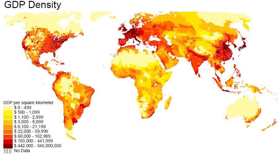
Map of the world's gross domestic product
The colors correspond to GDP per square kilometer, with the lowest GDP yellow and red the highest GDP. The large yellow areas that we see in Canada and Australia, developed country, corresponding to unpopulated areas or a low population density.
No hay comentarios:
Publicar un comentario
Entrada más reciente
Entrada antigua
Inicio
Suscribirse a:
Enviar comentarios (Atom)
No hay comentarios:
Publicar un comentario